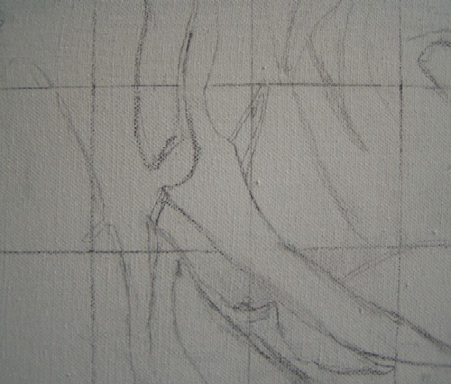
| I have a specific spot in mind for my painting, and the first picture fits that spot best for me. So, I'm going to copy that picture onto the canvas using a grid. First, I draw lines over the picture, 6 by 6 squares, all the same size. I also draw a grid of 6 by 6 squares on the canvas. I use a 2B pencil for this. Now I'm going to copy the most important lines. The picture still has some irregular lines, which I make a bit straighter. |
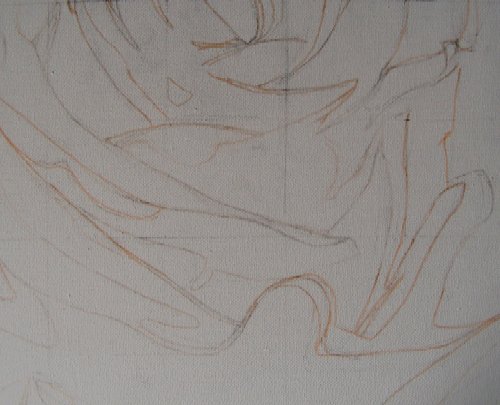
| When I'm happy with the sketch, I trace the most important lines with a light pink marker and erase the pencil lines. The graphite from the pencil makes the acrylic paint a bit smudgy, which is why I do it this way. |
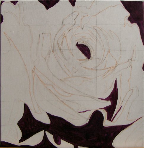
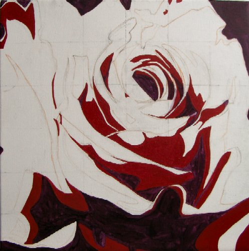
| I start by filling in the largest dark areas. These largely define the flower, giving it shape right away. The photo turned out quite dark, but I'm using a mixture of quinacridone magenta and cobalt blue deep (both from Finity). The latter tends a bit towards purple and can therefore be well mixed with purple/red tones. |
| Once I've done most of the darkest color, I move on to the dark red color. I use a mixture of cadmium red deep and a touch of quinacridone magenta for this. Adding quinacridone will bring more unity later and make the red slightly darker. |
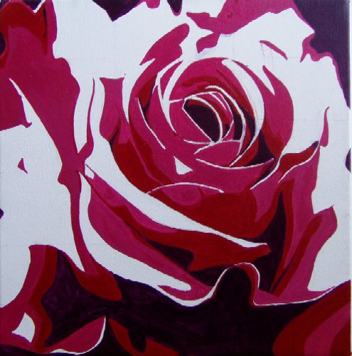
| Here I've painted the third color. I used a mixture of quinacridone violet, cadmium red deep (a touch), and white for this. I'm not following the exact areas of the computer picture everywhere, but I am following the main lines. The flower is really starting to take shape now. |
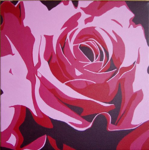
| The remaining white areas all need to be painted in the lightest shade. I choose a shade that is more in the same range, instead of the orange hue of the picture. For this, I mix white with quinacridone violet. I use a very small brush for the final thin lines because I want the lines to be "neat." The mixed color is opaque, so I can safely thin the paint a bit to make the thin lines even neater. |
| This project is finished. I really like the posterize option. One thing to watch out for with these kinds of fun "tricks" is not to let them dominate. It's a shame to base all your work on such a gimmick. I have one other project in mind where I would like to use this, but then I will look for something else... |


