Welcome at To be defined

Welcome at To be defined, a website filled with creativity. Here you will find numerous manuals in words and images on various subjects. On this page you can only see a selection. Choose from the menu on the left for more articles on your favorite topic.
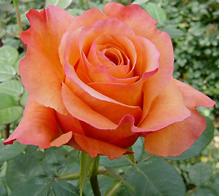
Example picture of a roseI want to work on a picture of a rose. It seems fun to try it out in a different way. I am very precise by nature and tend to want to draw and paint very realistically. That's fine, but I would also like to be able to draw things "differently."

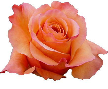
background removedTherefore, I decide to use my PC to see what I can do with it. For trying it out, I use the program Paint Shop Pro 9. Most likely, most actions can be done with other drawing packages as well.
I mainly want to depict the flower; I don't find the background very important in this picture myself. The flower is first selected. I use the "magic wand" option for this. By playing around with the settings, I select parts of the background. I then erase these parts. Eventually, I am left with only the flower itself.
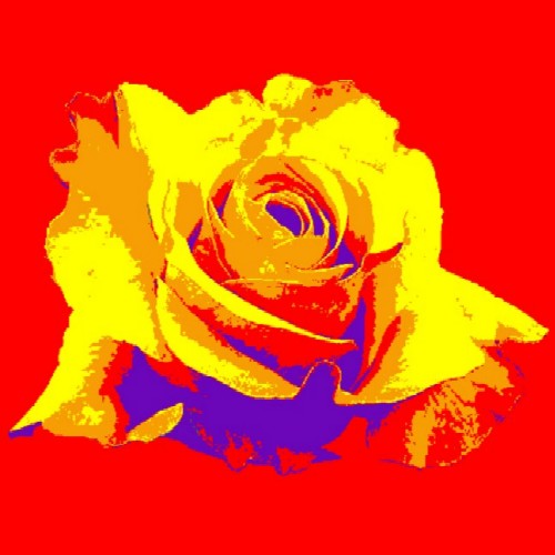
rose in shades of greyMy idea is to create a somewhat poster-like image. With only a few shades in it. To do this nicely, I first convert the picture to grayscale and then increase the contrasts a bit. Then, I use the "posterize" option to set the maximum number of shades to 4. Afterwards, I convert the picture back to 16 million colors. I made the background red here so that you can still see the picture that matters to me.
replacing colorsNow I'm going to play around with replacing colors. I do this with the "color replacer" tool. After some experimentation, this picture comes out. I save the picture and occasionally look at it to see if I really want this... After a while, I realize that it's too bright for me. I'm going to try out some other colors.
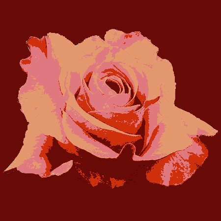
With colors from original pictureI'm going to see what it looks like if I use colors that are also present in the original flower. I do try to find different shades. After several attempts, I end up with this.
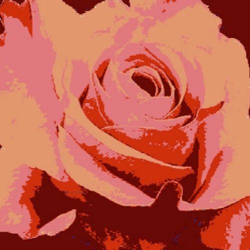
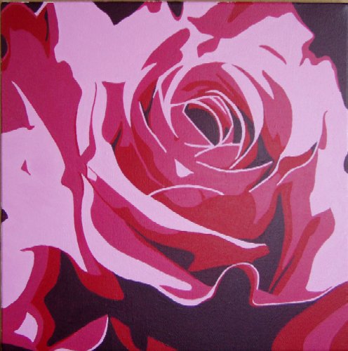
different cutoutIt's okay, but not quite. The space around it is too dominant for me. It has become two parts, one part flower and one part background. I just want to paint "Flower." That's why I'm looking for a crop where any remaining background residues simply become part of the picture. I'm satisfied with this. I want to work on this picture in acrylic on a canvas of 40 by 40 cm.
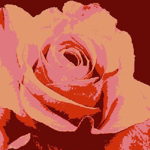
and another oneAlthough I've made my choice, there are of course many more options. For example, you can create a different crop and make more background visible at the top of the flower, as shown in the picture next to it. You can also use the same picture multiple times, possibly mirrored, rotated, or of a different size, in a total picture, you can apply another edit, the colors can be different, and so on.

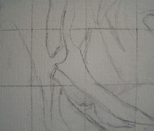
copy using a gridI have a specific spot in mind for my painting, and the first picture fits that spot best for me. So, I'm going to copy that picture onto the canvas using a grid. First, I draw lines over the picture, 6 by 6 squares, all the same size. I also draw a grid of 6 by 6 squares on the canvas. I use a 2B pencil for this. Now I'm going to copy the most important lines. The picture still has some irregular lines, which I make a bit straighter.
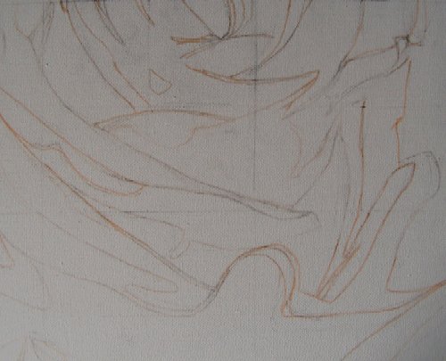
drawing the lines with a markerWhen I'm happy with the sketch, I trace the most important lines with a light pink marker and erase the pencil lines. The graphite from the pencil makes the acrylic paint a bit smudgy, which is why I do it this way.
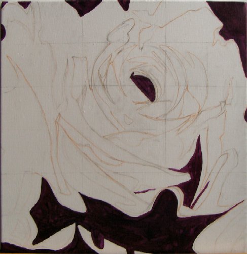
The darkest colorI start by filling in the largest dark areas. These largely define the flower, giving it shape right away. The photo turned out quite dark, but I'm using a mixture of quinacridone magenta and cobalt blue deep (both from Finity). The latter tends a bit towards purple and can therefore be well mixed with purple/red tones.
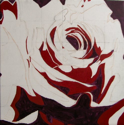
the next colorOnce I've done most of the darkest color, I move on to the dark red color. I use a mixture of cadmium red deep and a touch of quinacridone magenta for this. Adding quinacridone will bring more unity later and make the red slightly darker.
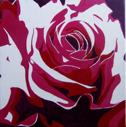
the third colorHere I've painted the third color. I used a mixture of quinacridone violet, cadmium red deep (a touch), and white for this. I'm not following the exact areas of the computer picture everywhere, but I am following the main lines. The flower is really starting to take shape now.
the last colorThe remaining white areas all need to be painted in the lightest shade. I choose a shade that is more in the same range, instead of the orange hue of the picture. For this, I mix white with quinacridone violet. I use a very small brush for the final thin lines because I want the lines to be "neat." The mixed color is opaque, so I can safely thin the paint a bit to make the thin lines even neater.
This project is finished. I really like the posterize option. One thing to watch out for with these kinds of fun "tricks" is not to let them dominate. It's a shame to base all your work on such a gimmick. I have one other project in mind where I would like to use this, but then I will look for something else...