Color Characteristics
To describe colors clearly, they are designated with color characteristics. Apart from hue, which refers to the "colors of the rainbow," other attributes include saturation (the opposite of grayness) and intensity (brightness). |
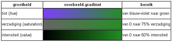
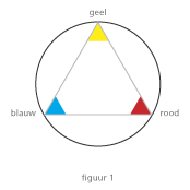
- Hue); A color is described by its hue (color type). This is the color we perceive, the color of the color; for example, red.
- Intensity; This is the brightness of a color, indicating how much a color can reflect light conspicuously.
- Saturation; This indicates how pure a color is. A pure color has its fullest, strongest, and most expressive color character. The more gray, white, or black present in the color, the less saturated it is.
|
Descriptions of Colors.
Besides color characteristics, there are other ways to describe color:
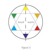
- Warm and cool colors; Colors lying in the red part of the circle, such as red, orange, and yellow, are called warm colors, while the rest, such as green, blue, and purple, are called cool colors. Mixing a bit of a cool color like purple into a warm color like yellow will create a cooler shade of yellow. Similarly, adding a warm color to a cool color can give the cool color a warmer effect. The concepts of warm and cool are relative.
- Pastel colors; Colors mixed with white become lighter, called pastel colors. These emit a soft and refined character.
- Muted colors; Colors mixed with black become darker, called muted colors. They often appear somber.
|
Color Contrasts
Colors also influence each other, creating color contrasts. Color contrasts arise when two or more colors are present side by side, resulting in a difference known as contrast. The purer the colors, the stronger the contrast. Choosing two colors from a circle that are far apart creates a significant color contrast. Some types of color contrasts include:
|
Color - against - color 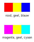 contrast: This includes all combinations where two colors of any difference are juxtaposed. The simplest color contrast arises from placing the purest colors with their greatest purity next to each other. Just as the greatest light-dark contrast arises between black and white, the greatest color contrast arises from the primary colors, such as red, yellow, and blue, or cyan, magenta, and yellow. contrast: This includes all combinations where two colors of any difference are juxtaposed. The simplest color contrast arises from placing the purest colors with their greatest purity next to each other. Just as the greatest light-dark contrast arises between black and white, the greatest color contrast arises from the primary colors, such as red, yellow, and blue, or cyan, magenta, and yellow. |
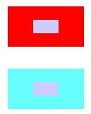
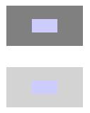 Light - dark contrast: These are combinations of light and dark colors, e.g., yellow-blue. This is also referred to as the "regular contrast." Light-dark contrast can occur between two colors, such as yellow and purple, but also between different nuances or tones of one color. The light purple color in the middle is the same in both blocks. In the top block, the purple appears much lighter due to the light-dark contrast than in the bottom block. Light - dark contrast: These are combinations of light and dark colors, e.g., yellow-blue. This is also referred to as the "regular contrast." Light-dark contrast can occur between two colors, such as yellow and purple, but also between different nuances or tones of one color. The light purple color in the middle is the same in both blocks. In the top block, the purple appears much lighter due to the light-dark contrast than in the bottom block. |
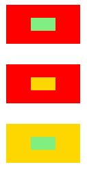
 Warm - cool contrast: Red, orange, and yellow are the warm colors; blue-green, blue, and purple are the cool colors. The warm-cool contrast is caused by some colors, especially those in the color wheel around the color red, giving a warm impression. Other colors, surrounding the color blue, give a cold impression. The warmth of a color in a painting can be enhanced by the warm-cool contrast by placing a cooler color next to it. In the example next to this one, the middle color in the warm red area gives a cool impression. If the same color is surrounded by a cold blue color, the impression is much warmer. Additionally, due to atmospheric perspective, a warm color appears to come forward, creating a difference in depth perception between the two examples next to each other. In the top figure, the center recedes, while in the bottom figure, the center appears to come forward. Warm - cool contrast: Red, orange, and yellow are the warm colors; blue-green, blue, and purple are the cool colors. The warm-cool contrast is caused by some colors, especially those in the color wheel around the color red, giving a warm impression. Other colors, surrounding the color blue, give a cold impression. The warmth of a color in a painting can be enhanced by the warm-cool contrast by placing a cooler color next to it. In the example next to this one, the middle color in the warm red area gives a cool impression. If the same color is surrounded by a cold blue color, the impression is much warmer. Additionally, due to atmospheric perspective, a warm color appears to come forward, creating a difference in depth perception between the two examples next to each other. In the top figure, the center recedes, while in the bottom figure, the center appears to come forward. |
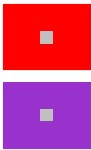
 Complementary Contrast: The strongest color contrast exists between complementary colors, between red and green, yellow and purple, blue and orange. The yellow color in the middle of the red appears less intense than the green color. An attempt has been made to keep the tone value (brightness) of the green and yellow equal, as shown in the lower block. The reason the green stands out more is because it is the complementary color of red.d. Complementary Contrast: The strongest color contrast exists between complementary colors, between red and green, yellow and purple, blue and orange. The yellow color in the middle of the red appears less intense than the green color. An attempt has been made to keep the tone value (brightness) of the green and yellow equal, as shown in the lower block. The reason the green stands out more is because it is the complementary color of red.d. |
 Simultaneous Contrast: This concerns the mutual influence of colors, especially in a nearly complementary combination. Simultaneous contrast means that if a particular color is strongly present, its complementary color always appears as an afterimage. In the examples below, the gray within the red block has a greenish hue, while the gray in the purple block exhibits a yellowish hue. It is important when viewing these blocks to cover up the other colors on this page as much as possible and to stare at the middle of the gray areas in the blocks for a long time. Simultaneous Contrast: This concerns the mutual influence of colors, especially in a nearly complementary combination. Simultaneous contrast means that if a particular color is strongly present, its complementary color always appears as an afterimage. In the examples below, the gray within the red block has a greenish hue, while the gray in the purple block exhibits a yellowish hue. It is important when viewing these blocks to cover up the other colors on this page as much as possible and to stare at the middle of the gray areas in the blocks for a long time. |
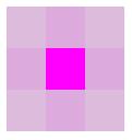 Quality Contrast: This refers to contrasts between colors of clearly different quality; grayscale or saturation. This is the contrast between bright, saturated colors, and dull, murky colors. Below is an example of a block of pure magenta in the middle and less intense, grayish magenta around it. Quality Contrast: This refers to contrasts between colors of clearly different quality; grayscale or saturation. This is the contrast between bright, saturated colors, and dull, murky colors. Below is an example of a block of pure magenta in the middle and less intense, grayish magenta around it. |
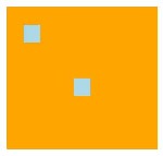 Quantity Contrast: Quantity contrast means that a strong and exciting contrast difference can arise by using colors in very different quantities. For example, by applying two small blue areas in a large orange field, as shown next to it. Quantity Contrast: Quantity contrast means that a strong and exciting contrast difference can arise by using colors in very different quantities. For example, by applying two small blue areas in a large orange field, as shown next to it. |

")
")
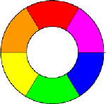
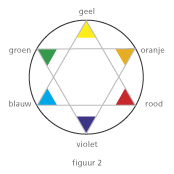
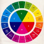
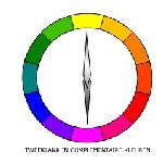
 The colorwheel
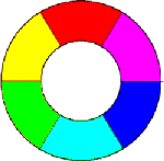
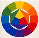
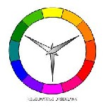
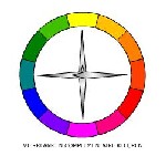 The monochrome and analog combinations are also called "on color", in analogy, this is only the case if the colors are close together.
 Harmony of Colors: