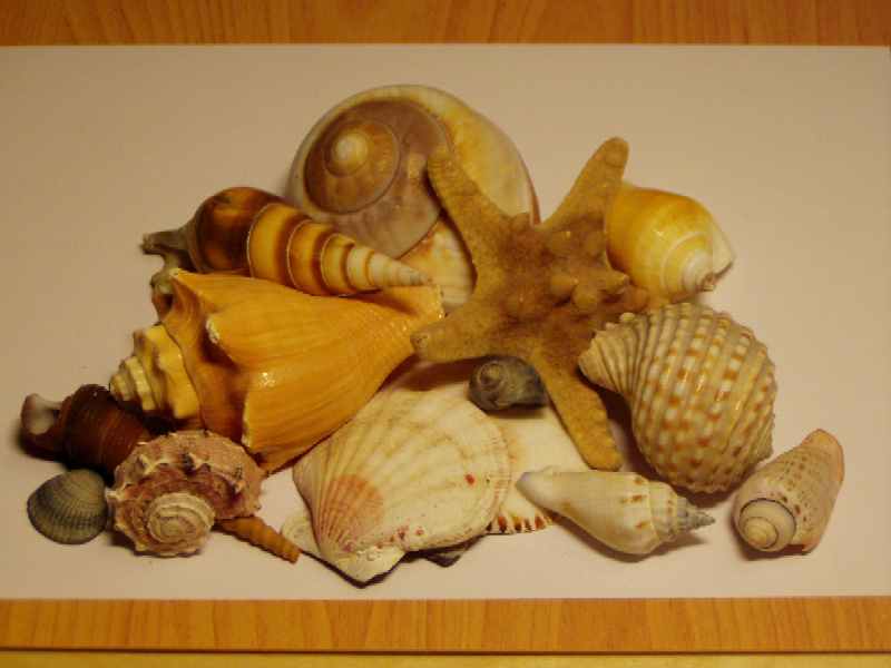
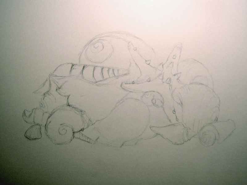
| The drawing is made on white 180-gram drawing paper with Karisma colored pencils. The sketch is roughly outlined with a 4B pencil. When the sketch is ready, I lighten the lines by dabbing them with kneaded eraser. If the lines are too thick, they would show through the colored pencil everywhere. Instead of a 4B graphite pencil, I could have also sketched the shells with a light color, which wouldn't interfere with the final result either. It’s just a matter of personal preference. |
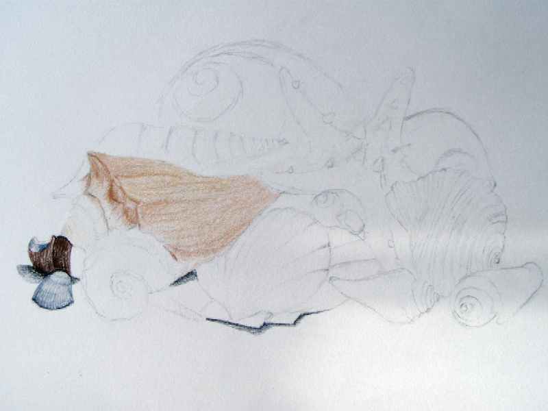
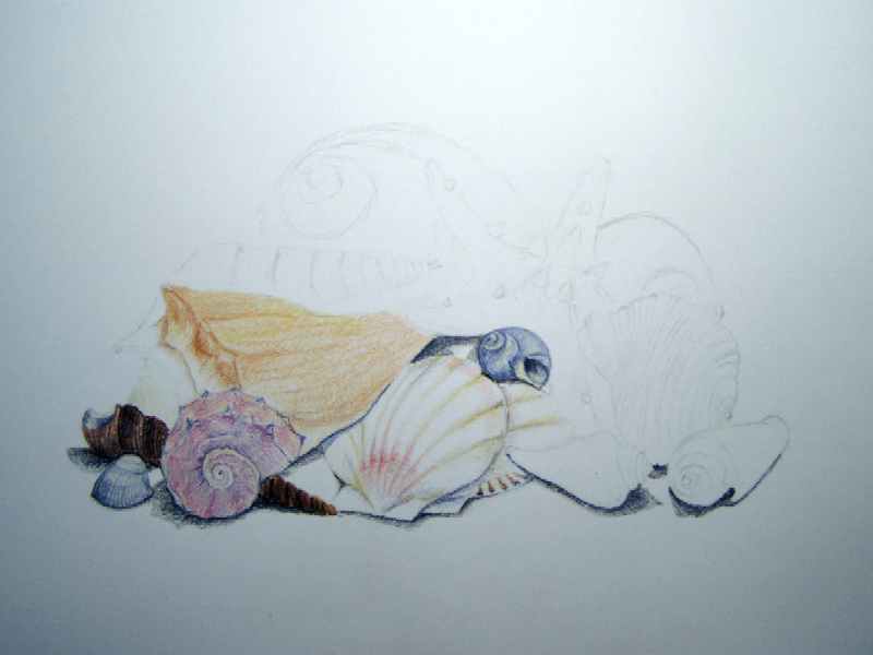
| Next to my drawing, I always have a white scrap of paper. On it, I test some colors before using them. I start cautiously with the small blue shell at the bottom left. First, I make sure the color is right (metallic blue), then I thicken the veins a bit more by pressing harder on the pencil. I add a shadow under the shell (warm grey, 90%). To create the illusion of depth, I lightly apply a layer of yellow (deco yellow) over the convex part of the shell. The main color of the long twisted shell is dark brown; the lighter parts are burnt ochre. |
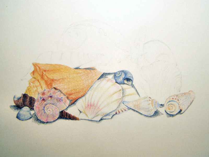
| Then follows shell by shell. It is also possible to first provide all shells with a light base and then gradually deepen them, but my preference is to finish one whole shell at a time. This is simply a matter of personal preference. The large yellow shell is mainly built up of 4 shades of brown/rose/orange (mineral orange, yellow ochre, deco orange, jasmine). The pink serrated shell at the front left is also built up of various shades (blush, lavender, dahlia purple, metallic purple). I use a little bit of yellow in the flat white shell, combined with one of the pink shades I already used. |
| Ultimately, about 15 colors are repeatedly used. Light shadows on the shells are made with a light blue-grey (blue slate, greyed lavender). Occasionally, I let the work rest and look at it from a distance. Here and there, I adjust the shadows a bit or add more color. I found the yellow shell not deep enough in color and make it more intense by going over it again. |
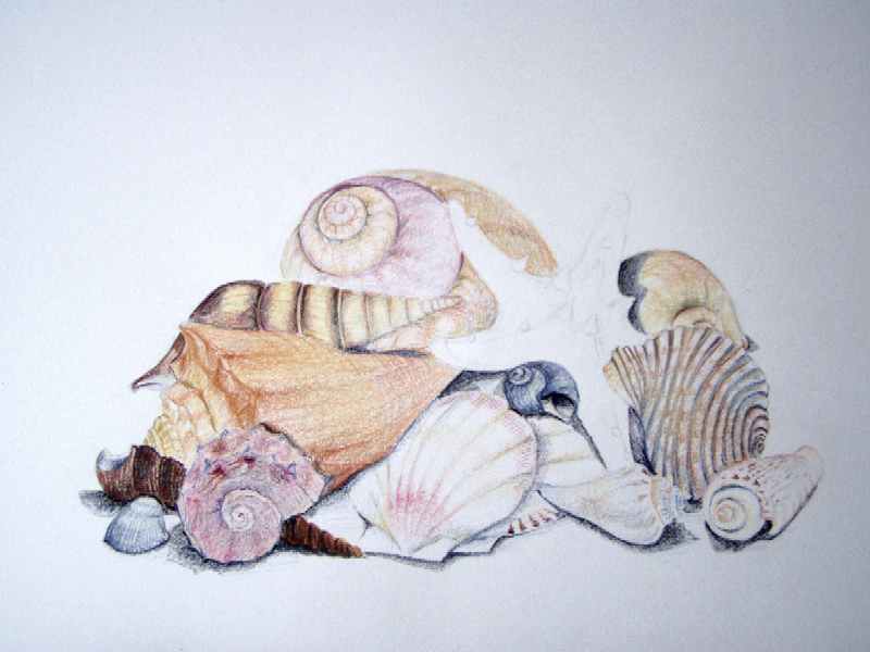
| Shell by shell is built up this way. The shadows under the shells create depth in the drawing. The shadows sometimes also extend over the shells. This also gives an extra sense of depth. I leave the starfish open for now, as I find it the most difficult in terms of shape. Especially the spines in the middle of the starfish are very challenging. |
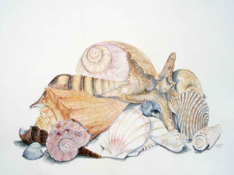
| Finally, the starfish is the only part that hasn't been colored yet. I start with it and again use a combination of colors previously used in the drawing. The starfish gets its shape by adding shadows. It no longer looks flat and stands out well. I view the whole piece from a distance one more time. If I am satisfied, I sign my name and the year in an inconspicuous spot. The drawing is finished. |


