For this exercise, we're using acrylic paint. You'll need the following colors:
- burnt umber
- ultramarine
- titanium white
Additionally, you'll need:
- paper
- pot of water
- brushes
- palette for mixing
It's also possible to mix black. In color theory, you've learned that you can mix black by combining the 3 primary colors. While that's true, what's often used is mixing: |
 burnt umber, a warm brown, burnt umber, a warm brown, |
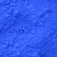 ultramarine, a cool blue. ultramarine, a cool blue. |
Both colors are available in practically every brand and are not very expensive. The downside of mixing black yourself is that a small difference in proportion can result in subtle color variations. Touching up a few pieces on your artwork with this black can quickly cause issues. However, at the same time, this is also an advantage. Mixing creates a vibrant color. Moreover, by varying the mixing ratio slightly, you can choose between a warm or cool black. Although we're talking about paint here, you can also mix black with, for example, colored pencil or pastel. With pastel, you'll need to blend the different colors well using a blending stump, tissue, or your fingers.
Tip!
Ultramarine and burnt umber can be mixed together to create a beautiful black. A bit more ultramarine gives a cool black, while a bit more burnt umber gives a warm black.
|
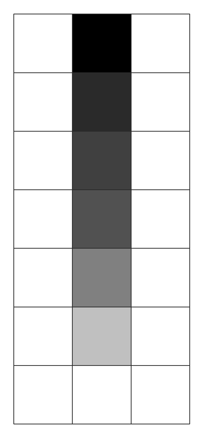
| In this exercise, we're going to mix blacks. We'll create a grid like the one next to this text, with 3 rows of 7 squares. The squares are approximately 3 by 3 cm in size. In these squares, we'll have various shades of black, from dark to light. We'll mix small amounts of burnt umber and ultramarine until we achieve a nice neutral black. The top square in the middle will be colored with the neutral black shade. Then, we'll add a little bit of titanium white. Titanium white is an opaque white paint. With the resulting gray shade, we'll color the second square from the top, in the middle row. Then, we'll add a bit more titanium white to the mixture, and so on. The bottom and 7th squares will be colored with pure titanium white. |
In this way, we create what we call a series of shades. Above, on the right, you can see what your grid looks like when you've completed the first series. Once we finish this series of shades, we'll mix a slightly warmer black shade. This can be achieved by adding a bit more burnt umber to the mixture. We'll also create a series of shades from this warmer black, to the left of the series of neutral black shades. Finally, we'll mix a slightly cooler black shade. This can be done by adding a bit more ultramarine to the mixture. With this shade, we'll create the last series of shades, to the right of the series of neutral black shades. Keep your series of shades; you might use it someday as a reference when looking for a certain shade of gray.
Here are a few examples of works where black is used prominently:
|
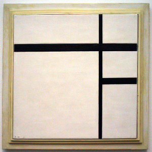
On the left, you see a work by Mondrian.
We mainly know Mondrian as a representative of De Stijl or neoplasticism. To prevent any association with "nature," observable reality, he only applied the "primary colors" red, blue, and yellow, supplemented with non-colors like gray, white, and black. Furthermore, he arranged planes and/or lines according to an orthogonal system and abandoned any other directional lines than the horizontal and vertical ones. This is a work consisting exclusively of black and white.
|
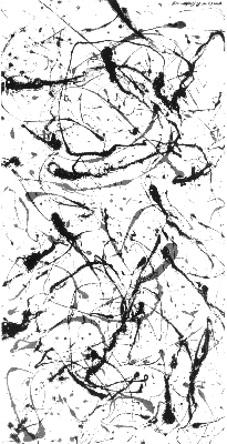
On the right, you see a piece by Jackson Pollock.
Pollock's work is classified as abstract expressionism, along with that of his contemporary Willem de Kooning. The emphasis on the act of painting is referred to as action painting. The painter applied highly rhythmic paint patterns to large canvases lying on the ground (all-over painting). The paintbrush did not touch the canvas; instead, the paint dripped onto the canvas in irregular streams, leading to the name of this type of work: drippings. This dripping technique became his trademark, earning him the nickname "Jack the Dripper."
|
| These are just a few examples of famous works in black and white. There are many more to be found. |


 burnt umber, a warm brown,
 ultramarine, a cool blue.
